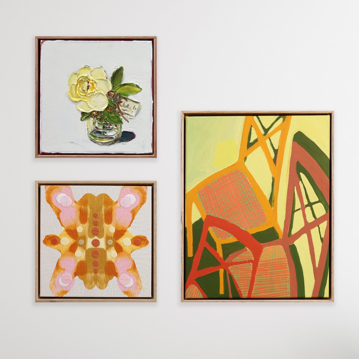
Curating a Gallery Wall

Curating your own gallery wall, or even just putting together a small group of works can be challenging. I know a lot of people find it tricky to pair artworks and are unsure of the best way to arrange them, so let’s talk about some of the things to look for when creating a collection of your own.

I Can Help

You can always get in touch if you’d like a one-on-one consultation with me. I LOVE curating collections for people and am more than happy to work with you. All I need is a photograph of your space as a starting point. Pop in and see me, or we can do a phone consultation. I can even pop out to your place if you’re in the area. Send me an email to get started.

Watch this video where I show you a few tips and tricks for hanging artwork, this is my mum’s gallery wall I installed for her, and here is my own gallery wall in my home.

Where to Start

Start with the artwork that speaks to you the most. People often go with their first instinct and they don’t always know why. Don’t worry about whether it matches the cushions on your couch. If you love it, you’ll find somewhere to hang it. From there you can look for the following qualities to “match” your favourite artwork.


How Many?

This one is tricky but 3 is a really good place to start, you can’t go wrong with 3. If you have a big space to fill, I always recommend starting with 3 and building on your collection from there. Either start with your favourite piece in the middle of the wall and build out from there. Or if you’re feeling experimental, try working outwards from a corner.

Here the common theme is colour. The styles are very varied but they still work. The abstract landscape is placed at the bottom with size and colour making is the “heavier” piece. Even though the frames are all different colours the collection is still consistent.

Artworks clockwise from left: Brendan Nicholl, Naomi Lawler and Simon Palmer.

Lines

This is an important one! When I say “lines”, I don’t mean lines or pattern in the work, I mean using the edges of the frames to line up the work when installing them in your space. This trick is really helpful for creating a consistent look when you’re using different sized works. For example; make sure the top of one frame lines up with the bottom of another. Or, if you have two works hanging above one another, make sure one edge of the frames lines up vertically.

These guys are pretty eclectic too but the yellow colour ties them together. I like the way they’re almost hung in a square. This would be nice installed in the left corner of a room. The edges lined up on the left side and bottom create a satisfying composition.

Clockwise from top: Leree Lindsay, Lily Platts and Helena Newcombe.

weight

When I say “weight” I don’t mean gravity weight. I mean the visual weight of the work. If you decide to hang one piece above another, think about which one looks visually heavier? Is one larger than the other? This might make the larger one “heavier”. I always hang the darker pieces at the bottom, this is what I mean by visual “weight”. Maybe they are the same size but one has a deeper frame than the other, this could mean this deeper frame is “heavier” and belongs at the bottom.

This collection uses a similar colour scheme to tie the works together. This time I’ve placed the smaller, abstract work below the larger still life because it seems “heavier” to me as it’s darker in tone. Again they are all completely different but this is a much more interesting grouping because of the variation in works.

Clockwise from left: Peter Tankey, Amanda Ogilby and Meg Walters.

Colour

One of the first things I look for when pairing artworks is colour. It might be the smallest hint of colour or the dominant feature. Try and mix it up; one work might have a tiny hint of yellow, and another might focus on a yellow flower as the main feature. I personally like the subjects of my collections to vary, so I’d pair a still life with an abstract and a landscape, all with at least a hint of the same colour.

I’ve used pinks and blues to tie these works together. Notice the larger “heavier” sun bather underneath the smaller work. The inside edges of these two frames line up which is really important. The styles, sizes and subjects are all completely different but the collection still works with the colours tying them together.

Clockwise from left: Emily Heath, Zoe Sernack and Jennifer Rosnell.

Subject / Theme

You may choose to hang a group of matching subjects but with different styles. For example, a group of three still life paintings of different styles and colour schemes. This is a fun one because it creates interest but gives you a starting point for choosing work.

I’ve used the same subject matter of still life to tie the work together, but they are all different styles. They’re all punchy and striking and the colours still work. I’ve placed the Nell Symonds at the top as it’s visually “light” in tone even though it’s larger. Notice the edge of the top piece lines up with the edge of the cocktail painting keeping the lines of the group consistent. The bottom two are different sizes but are the same height. The shapes are also all different. We have one square piece, one landscape and one portrait.

Clockwise from top: Nell Symonds, Alex Watts and Heather Froome.

Shape & Size

Shape can be a great way to tie works together too. Try to use all squares of different sizes, OR all portrait pieces of different sizes, for example.

Depending on your personality type, you may like the works to all be the same size, or prefer the size and measurements to vary. Think about hanging the pieces in a row, a grid or a random group.

Here, again it’s the colour scheme tying the works together. This is usually the easiest way to build a collection for most people. They are also all squares, different sizes, styles and subjects but the shape and colour creates consistency.

Clockwise from top: Jo Fernandez, Fleur Stevenson and Mary Donnelly.

Style

Maybe you’re a realism kind of person. You might choose a group of work that depict completely different subjects but are all painted in a realistic way. Or, if you’re like me, you might be into abstracts. You could choose an abstracted landscape to pair with something that is pure abstraction.

This collection is pretty random, which is how I like it. I’ve used all different shapes, sizes, colours, mediums and subjects, but they are all varied abstracts. The layout is different too, it seems top-heavy with the two pieces above one. But I feel the landscape is the “heavier” piece due to the colour and tone. Hanging the work off-centre like this makes the display more interesting. I’m still using the lines here with the frame edges on the right lining up and the bottom of the two top pieces lining up. You could hang a group in this layout in the right corner of a room and add pieces to the left over time.

Clockwise from top: Daniela Cristallo, Jackie Anderson and Ana Anderson.

Medium

Think about whether you’d like to mix mediums or keep them similar. Maybe you choose three textile works to create consistency. Maybe they’re all photographs. Or if you’re feeling adventurous, mix it up.

These guys are just fun, funky, colourful, punchy pieces with a little (or a lot) of bright red tying them together. Again, the edges line up and the sizes are all varied. And that is about all I have to say about that.

Clockwise from left: Yani Lenehan, Sophie Corks and Korynn Morrison.